
The Evolution of Accessibility Documentation in Government
The journey toward the current iteration of the DfE Accessibility and Inclusive Design Manual began in late 2024. Upon the initial release of the manual, the DfE digital team monitored engagement metrics and gathered qualitative feedback from various product teams. While the response was generally positive—indicating a high demand for centralized accessibility guidance—the data revealed friction points in how users navigated the content.
In the UK public sector, accessibility is not merely a preference but a legal requirement. The Public Sector Bodies (Websites and Mobile Applications) (No. 2) Accessibility Regulations 2018 mandate that all public sector websites and apps must be perceivable, operable, understandable, and robust (POUR). This legal framework, aligned with the Web Content Accessibility Guidelines (WCAG) 2.2, places a significant responsibility on the DfE, which manages a vast ecosystem of services ranging from teacher recruitment platforms to student finance interfaces and school performance tables.
Recognizing that a "one-size-fits-all" approach to documentation often leads to information overload, the DfE initiated a research phase in early 2025. This research focused on three primary objectives: understanding the specific workflows of different digital roles, identifying gaps in the existing "Knowledge Hub," and simplifying the navigation to reduce the time spent searching for technical requirements.
Chronology of Development and Implementation
The transformation of the manual followed a structured timeline designed to ensure that changes were evidence-based and rigorously tested.
- September 2024: The first version of the DfE Accessibility and Inclusive Design Manual is published. It establishes a baseline for inclusive design standards within the department.
- October 2024 – February 2025: Continuous monitoring of site analytics and the collection of unsolicited feedback from design communities within the government.
- March 2025: Formal user research begins. The team conducts interviews and usability testing with designers, product owners, and delivery managers to observe how they use the manual to solve real-world accessibility challenges.
- May 2025: Data synthesis and prototyping. The team identifies that the "Knowledge Hub" section is perceived as a "dumping ground" for miscellaneous information, leading to the decision to reorganize the site’s information architecture.
- June 2025: Iterative content design. Guidance on accessibility tools is rewritten to focus on practical application rather than just technical installation.
- July 21, 2025: The updated manual is officially launched, featuring a simplified homepage and a more logical content hierarchy.
- September 2025: Publication of the post-implementation review, detailing the improvements and the rationale behind the structural changes.
Structural Overhaul: Moving Beyond the Knowledge Hub
One of the most significant changes in the 2025 update was the complete removal of the section formerly known as the ‘Knowledge Hub.’ While the content within this section was deemed valuable, user research indicated that the label was too vague. In professional documentation, a "hub" often becomes a catch-all for content that does not have a clear home, which complicates the user journey for specialists looking for quick, actionable answers.
To rectify this, the DfE digital team redistributed the content into sections that align with the way digital teams think. Instead of browsing a general repository, users can now find information based on their specific stage in the product lifecycle or the specific component they are designing. This reorganization acknowledges that a designer looking for "alt-text" requirements has a different cognitive path than a delivery manager looking for "accessibility audit" procurement guidance. By mapping the content to the user journey, the DfE has reduced the "search tax" imposed on its staff, allowing for faster decision-making during the development process.
Improving Tools Guidance: A Shift Toward Human Needs
Another critical area of improvement was the "Tools" section. In previous versions, this section functioned primarily as a technical directory, listing various software packages and installation instructions for automated testing tools. However, feedback from the field suggested that knowing how to install a tool was less important than knowing when and why to use it.
The updated manual shifts the focus from the software to the person using it. New guidance provides context on which tools are most effective for specific tasks—such as manual keyboard testing versus automated contrast checking. This nuanced approach helps teams understand the limitations of automated tools, which typically only catch about 30% to 40% of accessibility issues. By emphasizing the human element of testing, the manual encourages a more thorough, manual review process that is essential for achieving true inclusivity.
Streamlining the User Interface and Experience
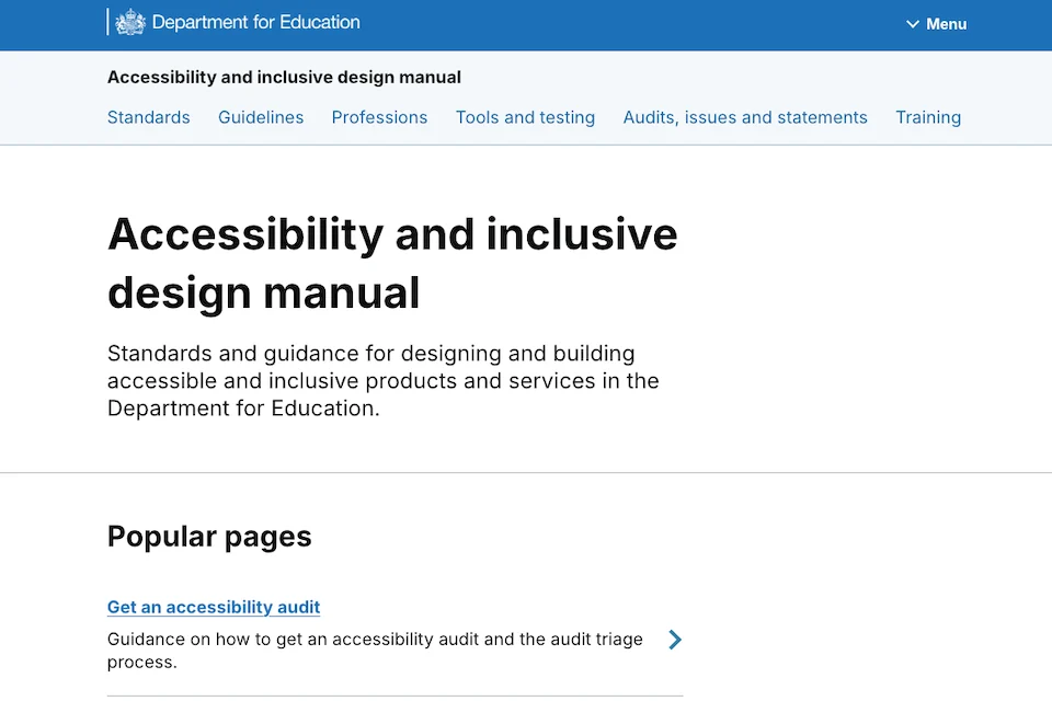
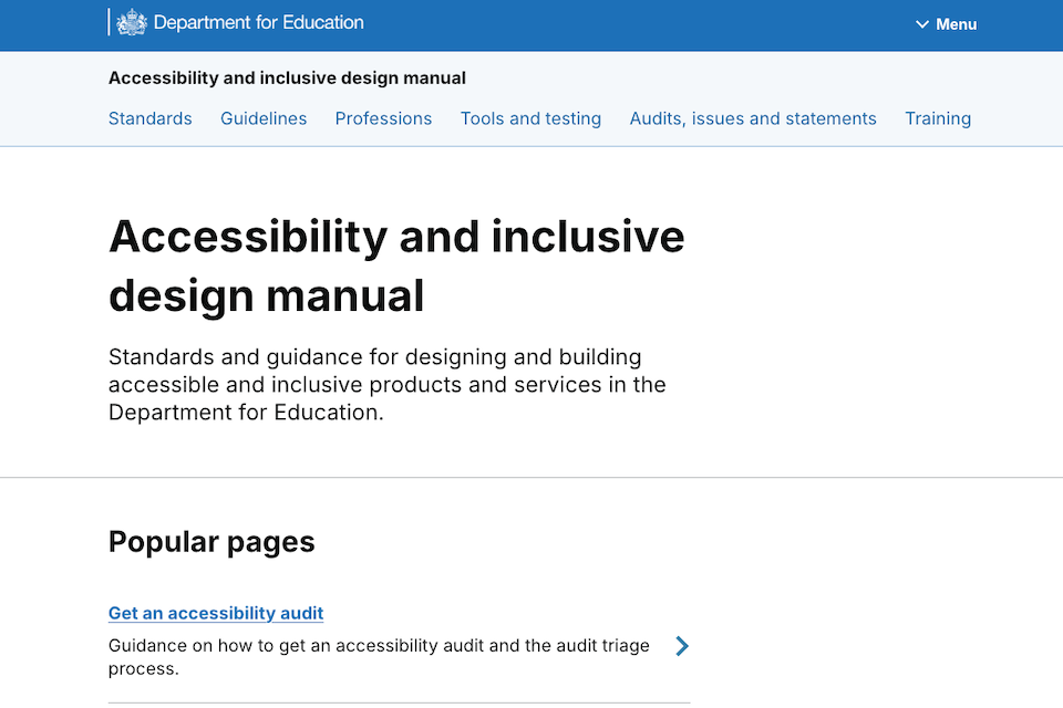
The visual and functional design of the manual’s homepage underwent a significant simplification. The previous iteration was noted for being "too busy," featuring an abundance of icons, decorative images, and a long-scroll format that overwhelmed users upon arrival. In the world of technical documentation, excessive visual stimuli can distract from the primary task of information retrieval.
The redesign focused on:
- Clarifying Navigation: The top navigation bar was refined to provide clear, unambiguous paths to the most frequently used sections.
- Reducing Cognitive Load: By removing unnecessary icons and images, the team ensured that the focus remained on the text and the guidance.
- Optimizing the Homepage: The "long scroll" was replaced with a more compact, high-density layout that allows users to see the full scope of the manual without excessive interaction.
These changes are a direct application of the very inclusive design principles the manual promotes. By making the manual itself more accessible and easier to use, the DfE is leading by example, demonstrating that professional-grade tools should be as streamlined as consumer-facing apps.
Supporting Data and the Case for Inclusive Design
The necessity for such a robust manual is supported by a wealth of data regarding disability and digital access in the United Kingdom. According to the Family Resources Survey, approximately 16 million people in the UK live with a disability, representing roughly 24% of the population. In the context of education, this includes students with visual impairments, neurodivergent staff members, and parents using assistive technologies to access school services.
Furthermore, data from the Government Digital Service (GDS) suggests that accessible websites are not only better for people with disabilities but are generally more performant and easier to use for all users. Services that follow inclusive design patterns typically see lower bounce rates and higher completion rates. Within the DfE, where services like "Apply for Teacher Training" handle thousands of applications annually, even a small percentage increase in usability can result in significant time savings for both the public and the department’s support staff.
Official Responses and Implications for the Future
While the manual was primarily developed for internal DfE teams, the department has made the resource public, recognizing its value to the wider design and development community. "Although it was created for DfE teams, anyone designing or building accessible services and websites can use it," the department stated in its official communication. This open-source approach to knowledge sharing is a hallmark of the UK government’s "Digital by Default" strategy.
Industry experts have noted that the DfE’s focus on the "user journey" for documentation sets a new benchmark for other departments. By treating a guidance manual as a product that requires its own user research and UX design, the DfE is addressing the common problem of "stagnant documentation."
The implications of this update extend beyond the Department for Education. As more government entities move toward unified design systems, the DfE manual provides a template for how to balance technical WCAG compliance with practical, role-based guidance. It signals a shift from "compliance-based design" (doing the bare minimum to meet legal standards) to "proactive inclusive design" (creating better experiences for everyone from the outset).
As digital services continue to evolve with the integration of AI and more complex user interfaces, the DfE Accessibility and Inclusive Design Manual will likely remain a "living document." The department has committed to ongoing cycles of feedback and updates, ensuring that as new technologies emerge, the guidance for making them inclusive remains current, clear, and, above all, useful. For now, the July 2025 update stands as a significant milestone in the department’s ongoing mission to ensure that education—and the digital tools that support it—is accessible to all.