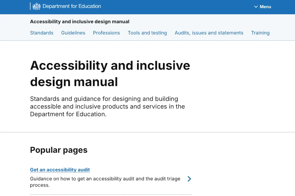
This revision follows nearly a year of intensive data gathering and user research initiated after the manual’s original publication in September 2024. While the initial launch was met with positive reception and high engagement metrics, internal audits and user feedback sessions revealed that the structure of the manual often hindered the very efficiency it was designed to promote. The 2025 update addresses these friction points, reorganizing the platform to align with the real-world workflows of designers, product managers, and delivery teams.
The Strategic Importance of Inclusive Design in Public Services
In the contemporary digital landscape, accessibility is no longer a secondary consideration or a "nice-to-have" feature; it is a fundamental requirement of public service delivery. In the United Kingdom, approximately 16 million people live with a disability, representing roughly 24% of the population. For these individuals, digital barriers can prevent access to essential services, including education, financial support, and employment resources.
The DfE’s commitment to inclusive design is rooted in the Public Sector Bodies (Websites and Mobile Applications) (No. 2) Accessibility Regulations 2018. These regulations mandate that public sector websites must be perceivable, operable, understandable, and robust (POUR), adhering to the Web Content Accessibility Guidelines (WCAG). As these standards evolve—most recently with the introduction of WCAG 2.2—the tools used by government teams must also evolve. The updated manual serves as a bridge between high-level regulatory requirements and the practical, day-to-day tasks of digital production teams.
Chronology of the Manual’s Evolution
The journey toward the 2025 update began in late 2024, shortly after the first version of the manual was released to DfE staff. While the "Knowledge Hub" within the original manual was intended to be a comprehensive source of information, analytics showed that users were often overwhelmed by the volume of content, leading to a phenomenon known as "choice paralysis."
In early 2025, the DfE accessibility team launched a dedicated research phase. This phase focused on three core objectives: understanding how different roles (design vs. delivery) interacted with the manual, identifying "dead ends" where users abandoned their search for information, and evaluating the effectiveness of the technical tools guidance. By March 2025, the team had identified that the manual’s architecture was too academic and not sufficiently task-oriented.
Throughout the second quarter of 2025, the DfE engaged in iterative prototyping. This involved "card sorting" exercises with staff to determine where information should logically live and "usability testing" to see if the new, simplified homepage reduced the time taken to find specific guidance. The culmination of this effort was the July 21 release, which saw a total restructuring of the manual’s information architecture.
Structural Overhaul: Moving Beyond the Knowledge Hub
One of the most significant changes in the 2025 update is the complete removal of the "Knowledge Hub" section. In the original version, the Knowledge Hub acted as a centralized library for all things related to accessibility. However, user research indicated that this section felt like a "dumping ground" for miscellaneous information. Users found it difficult to discern which pieces of information were relevant to their specific stage in the product development lifecycle.
The DfE team responded by dismantling the Hub and redistributing its content into sections that mirror the actual user journey. This "just-in-time" information delivery model ensures that a designer looking for guidance on color contrast finds it within the design section, rather than having to dig through a general knowledge repository. By categorizing content based on how people think and search—rather than by academic topic—the DfE has significantly reduced the cognitive load on its employees.
Redefining Guidance for Accessibility Tools
A common pitfall in digital accessibility is the over-reliance on automated tools without understanding their limitations. The previous version of the manual provided a list of recommended tools and technical instructions on how to install them. However, feedback from delivery roles indicated a gap in strategic understanding: users knew how to install the tools, but they didn’t always know when to use them or which tool was appropriate for a specific task.
The updated manual shifts the focus from installation to application. The new guidance for tools is structured around human needs and project milestones. It now answers critical questions such as:
- Which tool is best for identifying high-level structural issues in the early stages of development?
- How should manual testing be integrated alongside automated scans to capture issues that software might miss (such as logical reading order or screen reader nuances)?
- At what point in the delivery cycle should specific audits be performed to avoid costly retrofitting?
This change acknowledges that accessibility is a human-centric discipline. By providing context-sensitive guidance, the DfE ensures that its teams are not just "checking boxes" with automated software but are actually understanding the barriers they are trying to remove.
Streamlining the User Interface: The Homepage Redesign
The visual and navigational interface of the manual itself underwent a radical transformation. The original homepage was characterized by a "long scroll" format, populated with numerous icons and images that users found distracting. In professional environments, where speed and clarity are paramount, the "busy" nature of the old site was a barrier to efficiency.
The new homepage prioritizes a clean, minimalist aesthetic. The DfE removed unnecessary visual elements and redesigned the top navigation to be more intuitive. This "less is more" approach is an exercise in inclusive design itself; a simpler, more predictable layout benefits all users, including those with cognitive disabilities or those using assistive technologies like screen readers. The goal was to create a portal that feels like a professional tool rather than a promotional website.
Data-Driven Decisions and Performance Metrics
The DfE’s decision to update the manual was not based on aesthetic preference but on hard data. Internal analytics from the 2024-2025 period showed that while traffic to the manual was high, the "bounce rate" on certain deep-link pages within the Knowledge Hub was also high. This suggested that users were reaching the content but finding it too dense or irrelevant to their immediate needs.
Furthermore, the DfE looked at the types of accessibility errors being caught during final stage audits of new services. A recurring theme was that certain errors were being identified too late in the process. By reorganizing the manual to emphasize "shifting left"—the practice of considering accessibility at the very start of the design phase—the DfE aims to reduce the number of high-priority accessibility defects found in late-stage testing.
While specific percentage improvements in delivery speed are still being calculated following the July relaunch, early indicators suggest a more streamlined workflow. Delivery leads have reported that the new tools guidance has reduced the time spent on onboarding new staff to the department’s accessibility protocols.
Broader Implications for the Public Sector
While the Accessibility and Inclusive Design Manual was created specifically for DfE teams, its impact extends far beyond a single government department. The DfE has made the manual publicly available, encouraging anyone—from local authorities to private sector developers—to utilize its resources.
This move aligns with the broader "Government as a Platform" (GaaP) philosophy, which encourages the sharing of tools, code, and guidance across different agencies to reduce duplication of effort. As other departments look to refresh their own accessibility guidelines, the DfE’s research-led approach provides a blueprint for how to iterate on internal documentation.
The implications for the education sector are particularly profound. As more educational resources move online—including student loan applications, apprenticeship matching services, and teacher training portals—the DfE must lead by example. An inaccessible service in this sector doesn’t just represent a technical failure; it represents a barrier to opportunity. By refining its manual, the DfE is reinforcing the message that inclusive design is a prerequisite for a fair and equitable education system.
Conclusion and Future Outlook
The July 2025 update to the DfE Accessibility and Inclusive Design Manual is a testament to the importance of continuous improvement in the digital age. In an environment where technology and user expectations are constantly shifting, static guidance is insufficient. By listening to its users and applying the same principles of inclusive design to the manual that it expects in its services, the DfE has created a more robust, efficient, and user-friendly resource.
Looking ahead, the DfE accessibility team has indicated that the manual will remain a "living document." Future updates are expected to incorporate more detailed guidance on emerging technologies, such as the role of artificial intelligence in accessibility testing and the design of inclusive voice-user interfaces. For now, the 2025 version stands as a significant milestone in the department’s mission to make "digital by default" mean "inclusive for all." Professional designers and delivery teams are encouraged to explore the updated manual and integrate its task-based guidance into their standard operating procedures to ensure that no user is left behind in the digital transformation of education.