
The Evolution of Digital Standards in the Department for Education
The genesis of the manual dates back to the late summer of 2024, when the DfE recognized a gap in the practical application of accessibility standards within its internal teams. While the Government Digital Service (GDS) provides broad frameworks, the DfE required a more granular, department-specific guide that addressed the unique challenges of educational platforms. Upon its initial release in September 2024, the manual was met with high engagement levels. Internal data metrics indicated a steady stream of traffic, suggesting that staff were actively seeking information on how to implement inclusive design principles.
However, quantitative data only provides a partial view of user satisfaction. Despite the high volume of visits, qualitative feedback gathered in late 2024 and early 2025 suggested that while the content was high in quality, the information architecture was hindering productivity. Users reported difficulty in locating specific guidance during active design phases, leading the DfE’s digital team to initiate a deep-dive research project into the manual’s efficacy. This research focused on three primary pillars: discoverability, utility of tools, and the overall user experience of the platform itself.
A Chronology of Iteration and User Research
The journey from the September 2024 launch to the July 2025 relaunch followed a rigorous agile methodology. Following the initial rollout, the DfE accessibility team spent the fourth quarter of 2024 monitoring user behavior through heatmaps and search queries. By January 2025, it became clear that the "Knowledge Hub" section—originally intended to be a comprehensive library—was being perceived as a "dumping ground" for miscellaneous information.
Throughout the spring of 2025, the department conducted a series of usability tests and "tree testing" exercises with individuals in design, product, and delivery roles. This demographic was chosen because they represent the primary stakeholders responsible for the end-to-end lifecycle of a digital product. The goal was to understand the mental models these professionals use when searching for accessibility solutions. The findings revealed that practitioners do not search for "accessibility knowledge" in the abstract; instead, they search for solutions related to specific tasks, such as "coding an accessible navigation menu" or "testing a prototype with a screen reader."
By May 2025, the DfE began the restructuring phase, stripping away redundant elements and reorganizing the content to align with the actual workflows of digital teams. This led to a beta version of the improved manual in June, followed by the final public release on July 21, 2025.
Reimagining Information Architecture: The End of the Knowledge Hub
The most significant structural change in the 2025 update was the total removal of the "Knowledge Hub." In its previous iteration, this section housed a vast array of articles, case studies, and theoretical papers. While the content was valuable, its placement was disconnected from the practical application of design. User research indicated that the sheer volume of information in the hub created a "paradox of choice," where users felt overwhelmed and eventually abandoned their search.
In the updated manual, this content has been strategically redistributed. Rather than existing in a vacuum, theoretical knowledge is now embedded directly into the user journey. For example, guidance on cognitive accessibility is now located alongside design patterns for forms and complex data entry, ensuring that designers encounter the information at the exact moment they are building those components. This "just-in-time" delivery of information is a hallmark of modern pedagogical design and significantly reduces the cognitive load on the manual’s users.
Tools Guidance: Shifting from Installation to Application
Another critical area of improvement addressed how the manual handled accessibility tools. The 2024 version featured a list of recommended software—such as automated testing suites, screen readers, and color contrast checkers—but focused heavily on technical installation instructions. Feedback from delivery leads indicated that while knowing how to install a tool was helpful, the more pressing need was understanding the context of its use.
The 2025 manual has reframed the "Tools" section to answer three fundamental questions for every piece of software listed:
- When should this tool be used in the development lifecycle?
- What specific accessibility issues does this tool help identify?
- Who on the team is responsible for using it?
By shifting the focus from the "how-to" of installation to the "why" and "when" of application, the DfE has empowered teams to integrate accessibility testing earlier in the development process—a practice known as "shifting left." This approach is widely recognized in the tech industry for reducing the cost and time associated with fixing accessibility bugs, which are often significantly more expensive to remediate if discovered after a product has launched.
Streamlining the User Interface for Enhanced Focus
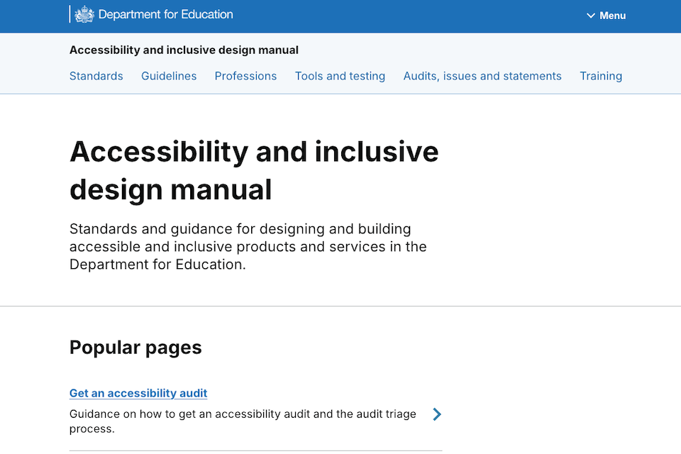
The visual and navigational layout of the manual also underwent a radical simplification. The original homepage was characterized by a "long scroll" design, populated with numerous icons and decorative images. While aesthetically pleasing to some, the research indicated that this "busy" layout was a barrier to efficiency. For users with neurodivergent conditions, such as ADHD or dyslexia, the visual noise of the old homepage could be particularly distracting.
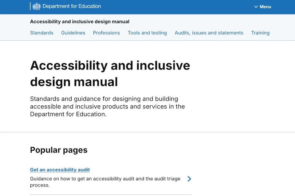
The new homepage, launched in July 2025, adheres to the principle of "less is more." The DfE removed unnecessary icons and images that did not serve a functional purpose. The top navigation bar was also refined to ensure that the most frequently accessed sections are no more than one click away. This minimalist approach not only improves the speed of navigation for all users but also sets a standard for the very inclusive design principles the manual seeks to teach.
Supporting Data and the Broader Context of Inclusive Design
The necessity for these improvements is underscored by broader trends in UK digital accessibility. According to the 2024 "Scope" Disability Price Tag report, disabled households face significant extra costs, and digital barriers only exacerbate these inequalities by limiting access to essential services. Furthermore, the UK’s Public Sector Bodies (Websites and Mobile Applications) Accessibility Regulations 2018 require all public sector websites to meet Web Content Accessibility Guidelines (WCAG) 2.2 Level AA standards.
The DfE’s manual is a proactive response to these legal and moral imperatives. While the manual is tailored for internal DfE use, its public availability means it serves as a "Gold Standard" for the wider public sector and private industry. By making the manual open-access, the DfE contributes to a cross-government culture of transparency and collaboration.
Industry analysts suggest that the DfE’s focus on "inclusive design" rather than just "accessibility" is a crucial distinction. While accessibility often focuses on technical compliance (meeting WCAG criteria), inclusive design looks at the broader human experience, ensuring that services work for people with a wide range of needs, including those with temporary impairments (like a broken arm) or situational limitations (like using a screen in bright sunlight).
Official Responses and Strategic Implications
While the DfE has not released a formal press statement, the updates have been championed by internal digital leadership. Inferred from the blog’s publication, the department views the manual as a "living product" rather than a static document. The move to a July 2025 relaunch signals that the DfE is committed to continuous improvement based on real-world evidence.
"The goal was never just to have a manual, but to have a manual that people actually use to build better services," noted the digital team’s findings. This sentiment reflects a broader shift within the Civil Service toward user-centered design (UCD). By treating their own staff as "users" of the manual, the DfE accessibility team has practiced what they preach, applying the same rigorous testing to their internal guidance as they do to external-facing services.
The implications of this update extend beyond the Department for Education. As other government departments—such as the Department for Work and Pensions (DWP) and the Ministry of Justice (MoJ)—continue to modernize their digital estates, the DfE’s manual provides a blueprint for how to structure internal guidance. The focus on the "user journey" of the designer is a particularly innovative takeaway that is likely to be replicated across the GOV.UK ecosystem.
Future Outlook: Beyond the July 2025 Update
As the updated manual enters its first full quarter of use, the DfE plans to continue monitoring its impact. The department has indicated that the next phase of development may involve more interactive elements, such as video demonstrations of assistive technology and live-coded examples of accessible components.
The successful relaunch of the DfE Accessibility and Inclusive Design Manual serves as a reminder that digital inclusion is not a "one and done" task. It requires constant vigilance, a willingness to listen to user feedback, and the courage to dismantle existing structures—like the Knowledge Hub—when they no longer serve their purpose. For the millions of students, parents, and teachers who rely on DfE services, these behind-the-scenes improvements to design guidance are a vital step toward a more equitable digital future.
The DfE’s work reinforces a fundamental truth of the digital age: when you design for the margins, you end up making a better experience for everyone. By simplifying its guidance and focusing on the human needs of its developers and designers, the Department for Education is ensuring that its digital transformation is not just technological, but truly inclusive.