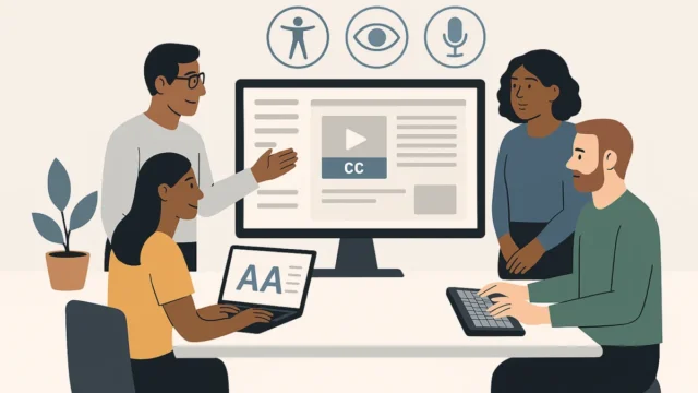
The update serves as a response to the evolving landscape of web standards and the specific needs of design, product, and delivery teams within the public sector. By streamlining navigation and prioritizing human-centric guidance over technical checklists, the DfE aims to ensure that all digital services—ranging from student finance portals to teacher recruitment platforms—are accessible to the widest possible audience, including the estimated 16 million people in the UK living with a disability.
Context and Regulatory Framework
The modernization of the DfE Accessibility and Inclusive Design Manual does not exist in a vacuum; it is a critical component of the department’s compliance with the Public Sector Bodies (Websites and Mobile Applications) (No. 2) Accessibility Regulations 2018. These regulations mandate that public sector websites and apps must be "perceivable, operable, understandable, and robust" (POUR). Furthermore, the recent transition to the Web Content Accessibility Guidelines (WCAG) 2.2 has placed additional pressure on government departments to update their internal documentation to reflect new criteria regarding motor disabilities, cognitive limitations, and low-vision requirements.
Since the initial version of the manual was published in September 2024, the DfE Digital team observed high engagement levels. However, internal data suggested that while users were accessing the content, the "time-to-task"—the duration it took for a designer or developer to find specific guidance—was higher than desired. This prompted a strategic review of the manual’s architecture to align it more closely with the Government Digital Service (GDS) Service Standard.
Chronology of Development
The journey toward the July 2025 update began almost immediately after the manual’s first iteration in late 2024. The development process followed a structured timeline:
- September 2024: The initial DfE Accessibility and Inclusive Design Manual was launched to provide a centralized hub for accessibility standards.
- October 2024 – February 2025: The DfE conducted a period of passive data collection, utilizing heatmaps and click-stream analysis to monitor how users navigated the site.
- March 2025: Qualitative user research commenced. This phase involved deep-dive interviews and usability testing with professionals in design, product management, and technical delivery roles.
- May 2025: Synthesis of research findings led to the identification of three primary pain points: cluttered information architecture, lack of context in tool guidance, and a visually overwhelming homepage.
- June 2025: The "Knowledge Hub" was decommissioned, and content was redistributed based on the "user journey" model.
- July 21, 2025: The improved manual went live, featuring a simplified UI and a more intuitive content hierarchy.
Research Insights and Focus Areas
The DfE’s research focused on three core pillars: findability, utility, and clarity. The research teams sought to understand not just if people could find information, but whether that information was actionable within the fast-paced environment of a "sprint" or a "discovery" phase.
A significant finding was the failure of the "Knowledge Hub" section. Initially designed as a comprehensive library, users frequently described it as a "dumping ground" for miscellaneous information. The lack of clear categorization meant that valuable resources were often buried. Research participants noted that they rarely browsed the hub; instead, they attempted to use search functions or external search engines to find specific DfE standards, often with mixed results.
Furthermore, the research highlighted a disconnect in how technical tools were presented. Previously, the manual provided a list of accessibility testing tools with installation instructions. However, users reported that they lacked the context to know which tool to use for specific scenarios, such as testing for screen reader compatibility versus checking color contrast ratios.
Key Structural and Content Changes
In response to these findings, the DfE implemented several transformative changes to the manual’s structure.
Decommissioning the Knowledge Hub
The most radical change was the total removal of the "Knowledge Hub" section. Rather than grouping content by "type" (e.g., all videos in one place, all articles in another), the team reorganized the content to fit the mental models of digital practitioners. Information was redistributed into sections that align with the stages of the service design lifecycle: Discovery, Alpha, Beta, and Live. This ensures that a designer looking for "inclusive research recruitment" finds it within the context of the Discovery phase, rather than in a generic list of articles.
Human-Centric Tool Guidance
The "Tools" section underwent a conceptual shift. Moving away from a purely technical "how-to-install" guide, the new guidance focuses on the "why" and "when." The updated manual now categorizes tools based on the user’s specific objective. For example, it distinguishes between automated linting tools for developers and manual testing protocols for quality assurance (QA) testers. This change acknowledges that accessibility is a shared responsibility across various roles, not just a final check performed by a single specialist.
Homepage Simplification and UI Enhancements
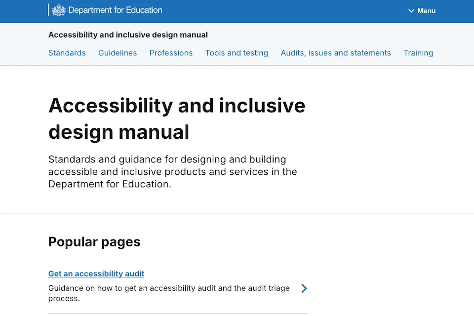
The original homepage was identified as a barrier to entry. With an excess of icons, images, and a long-scroll format, users suffered from "choice paralysis." The July 2025 update introduced a minimalist design. The top navigation was overhauled to provide a clearer hierarchy, and the "busy" visual elements were replaced with a clean, typography-focused layout that emphasizes the search function and core categories. This reduction in cognitive load is, in itself, an application of the inclusive design principles the manual promotes.
Supporting Data and Accessibility Metrics
The necessity for these improvements is underscored by broader demographic and technical data. According to the Office for National Statistics (ONS), the number of people reporting a long-term health condition or disability in the UK has risen significantly over the last decade. In the context of education, this includes students with neurodivergent conditions, parents with visual impairments using school application systems, and teachers with motor disabilities accessing internal DfE portals.
Data from the GDS suggests that websites that are optimized for accessibility see a 30% increase in successful "first-time" task completion. By making the manual easier for DfE staff to use, the department effectively lowers the barrier to creating high-quality, compliant services. This "shift left" approach—incorporating accessibility at the earliest stages of design—is estimated to be up to 100 times more cost-effective than fixing accessibility "bugs" after a service has launched.
Official Responses and Professional Impact
While the manual was developed primarily for internal DfE teams, its release as a public-facing resource has drawn praise from the wider digital community. Accessibility advocates have noted that the DfE’s willingness to iterate on its own internal tools sets a high standard for other government departments.
Internal stakeholders within the DfE’s Digital, Data and Technology (DDaT) profession have reacted positively to the changes. Lead designers have noted that the new structure allows for quicker onboarding of junior staff and contractors, who can now navigate the department’s specific requirements without extensive manual training. By providing a "single source of truth" that is actually easy to use, the DfE is fostering a culture where inclusive design is a default setting rather than an afterthought.
A spokesperson for the DfE accessibility team emphasized that the manual is a "living product." The team plans to continue monitoring usage patterns and will likely introduce further updates as WCAG standards continue to evolve and as new technologies, such as AI-driven accessibility testing, become more prevalent in the development workflow.
Broader Implications for the Public Sector
The successful update of the DfE Accessibility and Inclusive Design Manual has broader implications for how government departments approach internal documentation. It signals a move away from "comprehensive but unusable" manuals toward "lean and actionable" guidance.
As more public services move to a "digital-by-default" model, the stakes for inclusive design have never been higher. Failure to provide accessible services can lead to legal challenges, increased support costs through telephone helplines, and, most importantly, the exclusion of vulnerable citizens from essential services. The DfE’s data-driven approach to its manual provides a blueprint for other agencies: prioritize the user journey, simplify the interface, and treat internal documentation with the same level of UX rigor as a public-facing service.
In conclusion, the July 2025 update to the DfE Accessibility and Inclusive Design Manual is more than a simple content refresh. It is a strategic realignment of the department’s digital resources to better serve the people building the future of UK education. By focusing on the needs of design, product, and delivery roles, the DfE is ensuring that "inclusive by design" is not just a slogan, but a practical, achievable reality for all government digital services.