
The Evolution of Digital Accessibility Standards in Education
The DfE’s journey toward a more robust accessibility framework is rooted in the broader legal and ethical landscape of the United Kingdom. Under the Public Sector Bodies (Websites and Mobile Applications) (No. 2) Accessibility Regulations 2018, all public sector digital services are required to meet specific accessibility standards, primarily the Web Content Accessibility Guidelines (WCAG) 2.1—and more recently, version 2.2—at the AA level. For the Department for Education, which manages a vast ecosystem of services used by teachers, parents, students, and internal staff, the stakes are particularly high.
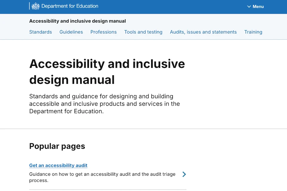
When the DfE first published the Accessibility and Inclusive Design Manual in late 2024, it was intended to be a centralized repository of best practices. Initial data indicated high engagement levels, suggesting a significant appetite for accessibility guidance among civil servants and contractors. However, as the user base grew, so did the complexity of the information provided. Feedback from the initial months of operation suggested that while the content was high in quality, its discoverability and practical application were hindered by a fragmented organizational structure.
Chronology of the 2025 Manual Update
The transition from the 2024 version to the current iteration followed a structured, evidence-based timeline. Following the September 2024 launch, the DfE digital team spent the fourth quarter of the year monitoring site metrics and gathering passive feedback. By early 2025, a formal research phase was initiated, focusing on three core pillars: content relevance, navigational efficiency, and the practical utility of technical tools.
Throughout the spring of 2025, researchers conducted deep-dive sessions with users across various roles, including interaction designers, content designers, product managers, and delivery leads. These sessions revealed that users were often overwhelmed by the volume of information and struggled to find specific guidance relevant to their stage in the project delivery process.
In May 2025, the DfE design team began prototyping the new structure, moving away from a static library model toward a more dynamic, journey-based approach. This period involved "card sorting" exercises and usability testing of the new homepage and navigation menus. By June, the content was being migrated and rewritten to ensure clarity and brevity. The final product was subjected to rigorous internal testing before its official release in July 2025.
Re-engineering Content Delivery: From Knowledge Hub to User Journey
One of the most significant changes in the 2025 update was the complete removal of the "Knowledge Hub" section. In the previous version, the Knowledge Hub served as a general repository for articles, case studies, and theoretical papers. However, user feedback indicated that this section had become a "dumping ground" for miscellaneous content, making it difficult for designers and developers to locate actionable advice.
To address this, the DfE team reorganized the content to align with how professionals actually think and work. Instead of grouping items by content type (e.g., "articles" vs. "guides"), the information is now categorized by the user’s intent and the stage of the design process. For example, guidance on creating accessible forms is now located within the "Design" section, while technical documentation on ARIA (Accessible Rich Internet Applications) labels is housed within the "Development" section.
This shift reflects a broader trend in government digital transformation: the move toward "task-based" navigation. By mapping the manual to the user journey, the DfE has reduced the cognitive load on staff, allowing them to find necessary information without navigating through irrelevant academic or background material.
Enhancing Tooling Guidance for Practical Application
A recurring theme in the user research was the need for better guidance on the tools used to test and implement accessibility features. In the 2024 version of the manual, the tools section was largely descriptive, providing a list of software and instructions for installation. While helpful for beginners, it failed to provide the "why" and "when" that experienced practitioners required.
The updated manual has transformed this section into a decision-support framework. Rather than just listing screen readers or automated testing suites, the manual now explains the specific scenarios in which each tool should be used. Key improvements include:
- Contextual Usage: Guidance on which tools are best suited for different stages of the development cycle (e.g., using automated checkers during early coding versus manual screen reader testing during final QA).
- Standardization: Establishing a "core toolkit" for DfE teams to ensure consistency across different projects and departments.
- Outcome-Focused Instructions: Shifting the focus from how a tool works to what problems it helps solve, such as identifying color contrast issues or ensuring keyboard navigability.
This approach acknowledges that accessibility is a multi-disciplinary effort. By providing role-specific tool guidance, the DfE ensures that delivery leads understand the resources their teams need, while developers have the technical specifications required to execute them.
Simplifying the User Experience: Homepage and Navigation
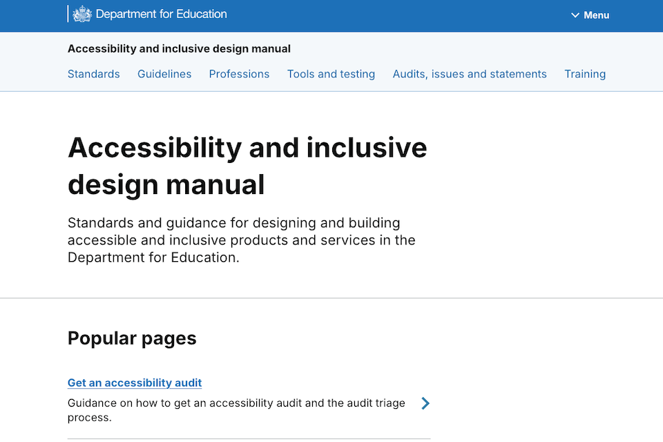
The visual and structural overhaul of the manual’s homepage was driven by a need for clarity. The 2024 interface was characterized by a "busy" layout, featuring numerous icons, decorative images, and an extensive vertical scroll. While visually engaging to some, this design proved problematic for users with neurodivergent conditions or those using assistive technologies, as it created unnecessary visual noise.
The 2025 redesign prioritized a "less is more" philosophy. The DfE team implemented the following changes:
- Reduction of Visual Clutter: Icons and images were scaled back or removed unless they served a direct functional purpose.
- Streamlined Navigation: The top-level navigation menu was simplified to focus on the most-searched-for categories, reducing the number of clicks required to reach deep-level content.
- Improved Search Functionality: Enhanced indexing ensures that users can jump directly to specific guidance from the homepage.
- Mobile Responsiveness: Recognizing that many users access the manual on secondary devices while coding or testing, the interface was optimized for various screen sizes.
Supporting Data and the Impact of Accessibility
The necessity of these updates is underscored by demographic data and the current state of digital inclusion in the UK. According to the Department for Work and Pensions (DWP), approximately 16 million people in the UK—nearly 24% of the population—report having a disability. As government services increasingly move to a "digital by default" model, the risk of excluding nearly a quarter of the population becomes a critical concern.
Furthermore, research from the Government Digital Service (GDS) has shown that accessible design benefits all users, not just those with permanent disabilities. Users in "situational" or "temporary" disability states—such as a parent holding a child or a student working in a high-glare environment—rely on the same inclusive design principles, such as high contrast and clear navigation, that the DfE manual promotes.
By investing in a more usable manual, the DfE is also addressing the "cost of failure." Retrospectively fixing accessibility issues in a live service is significantly more expensive than integrating inclusive design from the start. Industry estimates suggest that remediating a software bug post-launch can cost up to 100 times more than addressing it during the design phase. The DfE’s updated manual serves as a preventative measure, providing the education necessary to "shift left" and catch accessibility barriers early in the development process.
Official Responses and Strategic Implications
While the manual was primarily designed for internal DfE teams, its public availability reflects a broader strategy of open-source governance. By making the manual accessible to the public, the DfE is contributing to a cross-government culture of knowledge sharing.
Digital leads within the DfE have noted that the update has already begun to change the internal conversation regarding service delivery. "The manual isn’t just a document; it’s a living part of our infrastructure," noted one senior product manager involved in the project. "By making it easier to use, we are removing the friction that often prevents teams from fully embracing inclusive design."
Accessibility advocates within the civil service have also praised the DfE’s willingness to iterate based on user research. The transition from a "knowledge-heavy" site to a "task-heavy" site is seen as a benchmark for other government departments looking to update their own internal standards.
Broader Impact on the Public Sector and Beyond
The implications of the DfE Accessibility and Inclusive Design Manual extend beyond the borders of the department. As one of the most comprehensive resources of its kind, it provides a roadmap for other public sector bodies and private organizations alike. In an era where digital equity is increasingly scrutinized, the DfE’s proactive approach sets a high standard for transparency and user-centricity.
The update also aligns with the broader "Modernising Government" agenda, which emphasizes the use of shared components and standards to increase efficiency. By providing a clear, authoritative source of truth, the DfE reduces the need for individual teams to "reinvent the wheel" when it comes to accessibility, leading to more consistent user experiences across the entire educational digital landscape.
As the manual enters its next phase of life, the DfE has committed to a policy of continuous improvement. The team plans to continue monitoring usage data and will incorporate feedback from the wider community of designers and developers who use the site. In doing so, the Department for Education ensures that its digital services remain not only compliant with the law but truly inclusive for every citizen they serve.